Canva becomes much easier when you stop treating every design as a blank page. The most useful beginner tricks are not hidden effects. They are small habits that keep files organized, make layouts consistent, prevent accidental changes, and help the final design remain readable on the device where people will see it.
10 Canva Hacks Every Beginner Should Know in 2025
Use ten practical Canva habits to improve sizing, hierarchy, alignment, components, shortcuts, images, brand consistency, accessibility, and exports.
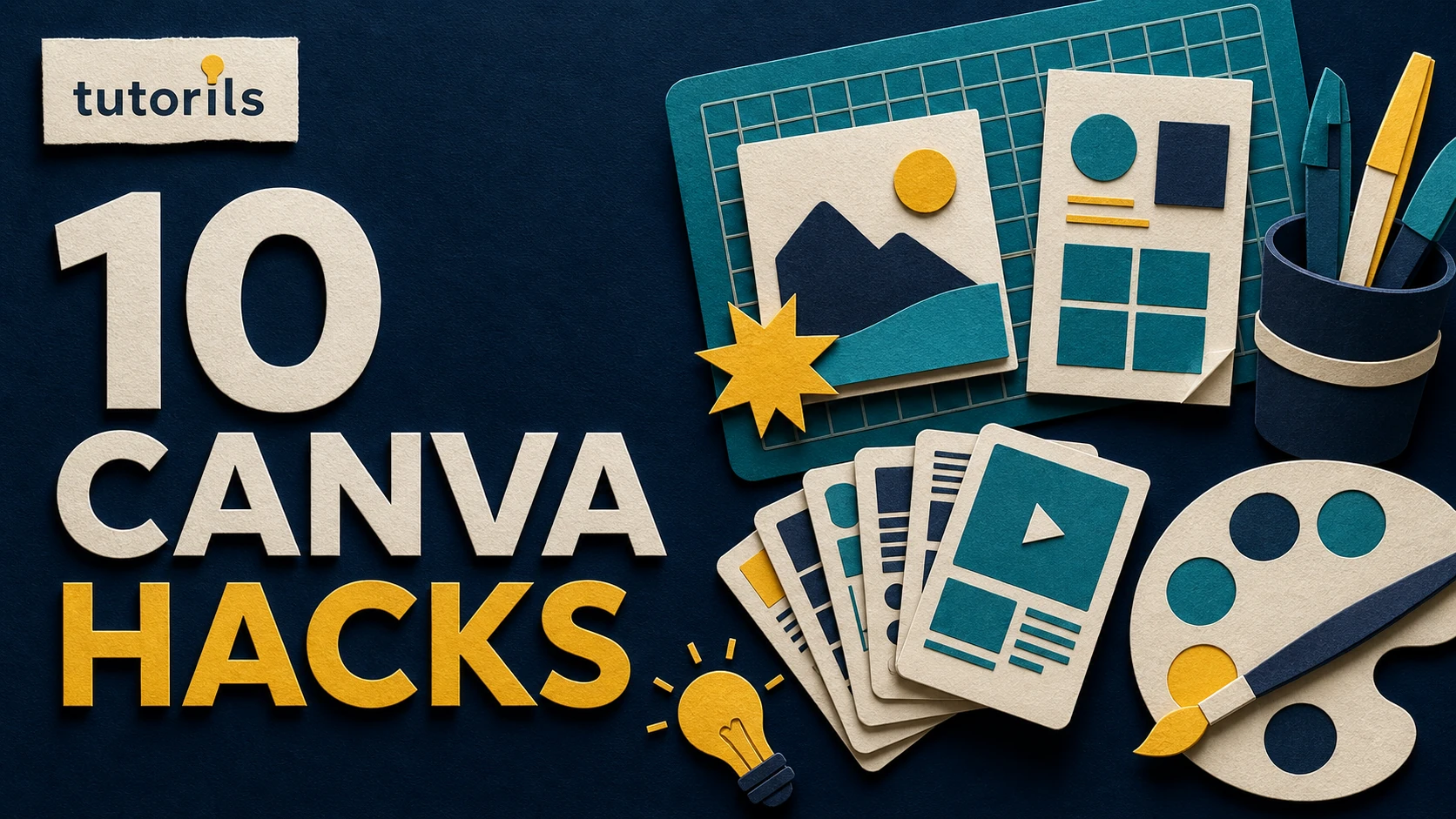
These ten Canva hacks work as a practical workflow. Feature names, plan access, and menus can change, so use the current Canva interface and official help when a control looks different. Begin with a copy of your design, especially when you are learning a new editing tool.
1. Choose the final size before designing
Start with the destination. A presentation slide, square social post, vertical story, blog thumbnail, and printable flyer use different proportions. Changing the canvas late can force text, images, and margins into awkward positions.
Write down the required dimensions, file type, maximum upload size, and safe area before opening a template. Check the publishing platform's current specifications rather than copying an old chart. If one design needs several formats, decide which version is primary and rebuild the composition for each important ratio.
Do not stretch a finished layout to fit. A wide hero image often needs a different crop and text arrangement from a vertical story. Canva resize tools can create a starting copy when available, but inspect every page. The subject may be cropped, a logo may move too close to an edge, or text may wrap differently.
Keep a small setup note in the design title or project folder: Instagram portrait, 1080 x 1350, final review on phone. That prevents team members from exporting the wrong version.
2. Build a simple visual hierarchy before styling
A viewer should know what to read first, second, and third. Begin with three levels: a main message, supporting detail, and optional action or source. Make the main message distinct through size, weight, position, or contrast rather than adding several decorative effects.
Use placeholder text first. If the design does not make sense in plain black and white, more colors will not fix the structure. Shorten the message until it can be understood at the actual display size.
Limit the number of font families. One family with several weights often creates enough distinction. If you pair two families, give each a stable job. For example, use one for headings and one for body text across the whole project.
The Tutorils guide to color psychology for thumbnails and social posts explains how to choose color by readability and context rather than relying on unsupported promises about emotional reactions.
3. Use rulers, guides, margins, and position tools
Beginners often align elements by eye and then wonder why the design feels slightly uneven. Turn on rulers and guides where the current editor supports them. Add vertical and horizontal guides for margins, the visual center, and repeated columns.
Canva's official keyboard shortcut reference includes shortcuts for showing rulers and guides, zooming, arranging elements, navigating the canvas, and opening quick actions. The exact key combination differs between Windows and macOS, so check the appropriate column.
Use the Position panel to align several selected elements and distribute their spacing. Compare the outer margins as well as the gaps between objects. A row can be evenly spaced but still sit too close to one side of the page.
Guides should support the content, not trap it. A portrait may need optical balance because the face carries more visual weight than empty background. Begin with mathematical alignment, then make a small visual adjustment and review at normal size.
4. Group related objects and lock finished layers
When a label contains a shape, icon, and text, select and group them after the spacing is correct. You can then move or duplicate the unit without losing its internal alignment. Ungroup only when you need to edit one part.
Lock background elements, repeated borders, and approved logo placement. This prevents accidental movement while selecting an object above them. Do not lock unfinished content so early that simple corrections become frustrating.
Use a layer order that makes sense. Background at the bottom, photographs and large shapes next, content elements above them, and essential text at the top. If an item appears missing, inspect whether it moved behind another layer before recreating it.
Name complex pages or sections clearly when the interface allows it. In a long presentation, labels such as opening, process, comparison, and sources are more useful than a sequence of nearly identical thumbnails.
5. Duplicate a working component instead of rebuilding it
Once a heading block, quote card, comparison row, or callout is correct, duplicate it and replace the content. Rebuilding the same component by hand creates small differences in font size, padding, border thickness, and alignment.
Create a private component page at the end of the project. Store approved headings, buttons, source lines, icon labels, and card styles there. Duplicate from that page, then delete the component page before the final export if it should not appear.
For recurring brand work, move these decisions into a reusable template. The Tutorils guide to creating a brand kit in Canva explains how to organize logos, colors, fonts, and export rules. Plan and team access can affect which brand controls are available.
Templates are starting structures, not a reason to force every subject into one layout. Change the composition when a product, portrait, chart, or long word needs different space. Preserve recognizable brand rules while giving the content enough room.
6. Learn a small set of keyboard shortcuts
You do not need to memorize the entire shortcut list. Choose the actions you repeat most: undo, redo, copy, paste, duplicate, group, ungroup, bring forward, send backward, zoom to fit, and add basic text or shapes.
Practice with a disposable page. Add three shapes, align them, group them, duplicate the group, move it behind another element, and undo the change. This ten-minute exercise makes later editing much faster and safer.
Shortcuts can behave differently depending on the selected object, browser, operating system, or desktop app. If a command does not work, use Canva's current shortcut reference rather than repeatedly pressing keys in a live client design.
Fast editing is valuable only when it remains controlled. Pause before deleting a page, flattening an export, replacing an upload, or accepting an AI edit. A shortcut should remove repetition, not remove review.
7. Crop images deliberately and remove backgrounds carefully
Place the subject where it supports the text. If text sits on the left, a subject looking toward the center from the right can create a natural reading path. Leave breathing room around faces, products, and logos. Do not crop hands, hair, or important product details without a reason.
Canva's official Background Remover page describes automatic removal followed by controls to refine erased or restored areas. Access can depend on the current plan. Always inspect hair, transparent objects, shadows, and edges against both light and dark backgrounds.
Keep the original upload. Background removal does not repair a low-resolution image, incorrect focus, or missing detail. For an exact product or official document, use a verified image rather than a generated approximation.
Check the licence and permission for every photo, illustration, video, sound, and font. Finding an image online or adding a credit does not automatically grant reuse rights. Store the licence record with the project.
8. Use styles and brand colors as controlled options
Save a small palette with named roles: primary background, main text, accent, muted surface, and alert. This makes it easier to judge whether a new color is necessary. Avoid using every brand color in every design.
Use Canva's style suggestions or AI-assisted variants only as options to review. Confirm that the result preserves the logo, required color contrast, source line, and content hierarchy. A visually interesting combination can still be difficult to read or inconsistent with the brand.
Create a grayscale check by temporarily viewing or exporting a copy without color when possible. If the main message disappears, the hierarchy depends too heavily on hue. Strengthen size, weight, spacing, or light and dark contrast.
The Tutorils Canva AI features guide provides a safe process for using generated suggestions without allowing them to replace editorial or brand review.
9. Run Canva's accessibility checks and review manually
Accessible design helps more people understand the work. Canva's current accessibility overview describes Design Accessibility checks for issues such as contrast, typography, and alternative text, along with caption and PDF accessibility features.
Use the built-in check where available, then inspect the design yourself. Confirm that text has enough contrast, important information is not conveyed only through color, video includes corrected captions, and meaningful images have useful alternative text in the final publishing system.
Read the design at actual size on a phone. A heading that looks comfortable on a large monitor may become tiny in a feed. Check whether interface overlays, cropping, or a platform button will cover the message.
Avoid placing long paragraphs inside images. Search engines and assistive technology may not receive that text, and users cannot resize it independently. Put detailed explanations in the page or post body.
10. Export a test before downloading the final files
Select the file type by use. PNG can suit sharp web graphics and transparency. JPG can reduce the size of photographic web images. PDF options differ for viewing and print. Video exports need the destination's accepted format, resolution, frame rate, and duration.
Export one test page first. Open the file outside Canva and check dimensions, cropping, transparency, animation, spelling, links, image quality, and size. Send it to the actual device or platform preview when possible.
Use predictable filenames such as campaign-topic-platform-size-v03-approved.png. Avoid final-final-new.png. Keep editable source, approved export, and compressed delivery copy separate.
For blog and social designs, the Tutorils guide to creating social media posts in Canva explains a full brief-to-export workflow that works with these ten habits.
A repeatable beginner quality check
Before approval, ask:
- Is the final size correct for the destination?
- Can the main message be understood in a few seconds?
- Are margins and repeated gaps consistent?
- Are fonts, colors, and logos from the approved system?
- Are photographs and stock assets licensed for this use?
- Does the design remain readable at actual size?
- Are captions and alternative text accurate where needed?
- Are dates, names, links, prices, and claims verified?
- Has the exported file been opened and checked?
- Is the approved version stored with a clear filename?
The most useful Canva hacks are disciplined shortcuts. Set the correct canvas, establish hierarchy, align with guides, group and lock stable components, duplicate what already works, learn repeatable commands, crop intentionally, control styles, check accessibility, and test the export. These habits save time because they prevent rework, not because they make review optional.
Keep a short decision record for recurring projects. Note the approved dimensions, template, palette, fonts, image source, accessibility result, export setting, reviewer, and date. When the next design begins, duplicate the approved source instead of searching through old downloads. This record also makes updates safer when a platform changes its crop or file limit. If a new feature produces a better result, compare it with the existing process on one sample before changing the whole template library. A stable system should be easy for another person to understand, reproduce, and correct.
Reader answers
Frequently asked questions
Open a question to read the answer. Opening another answer closes the previous one.
What are the most useful Canva hacks for beginners?
Start with the correct dimensions, create a clear hierarchy, align with guides, group related objects, duplicate approved components, learn common shortcuts, crop intentionally, control brand styles, check accessibility, and test exports.
How do I make a Canva design look professional?
Use consistent margins, limited fonts, a small color palette, one clear focal point, readable contrast, licensed images, and repeated components. Review the design at its actual display size before exporting.
Should I use a Canva template or start from scratch?
A suitable template can provide structure, but adapt it to the audience, message, dimensions, and brand. Remove unnecessary decoration and change the composition when the content needs different space.
How can I align elements evenly in Canva?
Turn on rulers and guides where available, select related elements, and use the Position controls for alignment and distribution. Check both the gaps between objects and the outer page margins.
Why should I group and lock Canva elements?
Grouping preserves spacing inside a finished component when it moves or duplicates. Locking stable backgrounds, borders, or logo placement reduces accidental edits while you work on content above them.
Which Canva keyboard shortcuts should beginners learn first?
Learn undo, redo, copy, paste, duplicate, group, ungroup, arrange forward or backward, zoom to fit, and shortcuts for basic text or shapes. Check Canva's current Windows or macOS reference.
Does Canva Background Remover always work perfectly?
No. Automatic removal can miss hair, transparent objects, shadows, or fine edges. Inspect the cutout against light and dark backgrounds and refine erased or restored areas where the current tool permits.
How do I check Canva designs for accessibility?
Use Canva's Design Accessibility tools where available, then manually check contrast, type size, color-only meaning, captions, alt text, reading order, and the actual mobile or exported experience.
What file type should I export from Canva?
Choose by destination. PNG suits sharp web graphics and transparency, JPG often suits photographs with smaller files, and PDF options differ for screen and print. Follow the platform or printer's current requirements.
Can I use every Canva image commercially?
Not automatically. Check the current licence for the asset, plan, and intended use. Keep records and consider trademarks, model releases, third-party rights, and restrictions that may apply outside Canva.