
A headline can look perfectly balanced on a large design canvas and become unreadable when the same artwork appears as a small card, a cropped preview, or a mobile thumbnail. A text-safe area gives important words a protected region away from edges and unpredictable overlays.
How to Create a Safe Text Area for 16:9 Artwork
Create a reusable text-safe area for 16:9 artwork, then test margins, contrast, cropping, logo placement, and mobile readability.
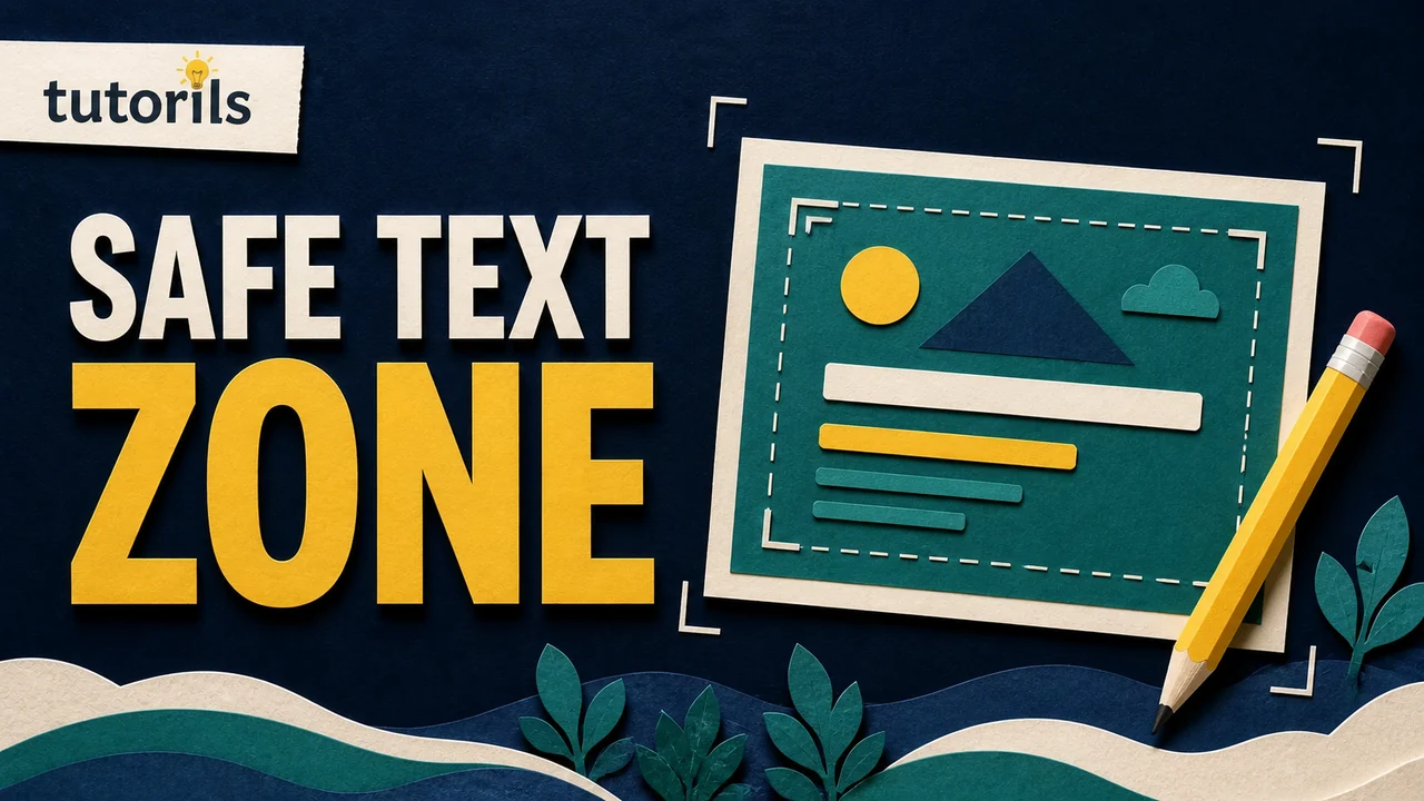
For a 16:9 image, a practical starting point is a guide inset by 10 percent on every side. This follows the conventional title-safe zone described in Adobe's video guidance. It is a starting template, not a guarantee for every website, player, or social feed. You still need to preview the real destination and test the image at the size people will see.
This tutorial shows how to calculate the guides, place text and branding, check contrast, and build a reusable file without tying the process to one design app.
What a text-safe area protects
A safe area protects information that must remain visible: the main headline, a small brand mark, a price or date when it is essential, and any symbol required to understand the message. Decorative backgrounds can extend to the edge because losing a small part of them should not change the meaning.
Safe placement helps with several common problems:
- a platform crops a few pixels from an edge
- a card uses a different preview ratio
- interface controls overlap a corner
- a long title grows during editing
- the image is reduced until edge text becomes difficult to scan
It does not solve every readability problem. Text can sit inside the guide and still fail because it is too small, lacks contrast, uses a busy background, or contains too many words. Treat safe placement, typography, and contrast as separate checks.
The guide is most useful during composition. It gives the designer a visible boundary before the layout becomes crowded. Once the file is exported, the guide itself should not appear in the final image.
Start with the correct 16:9 canvas
A 16:9 ratio means the width is sixteen units for every nine units of height. Common pixel sizes include:
- 1280 by 720 pixels
- 1920 by 1080 pixels
- 3840 by 2160 pixels
All three use the same ratio. Choose a size that meets the destination's current requirements and gives you enough detail for the intended display. YouTube's custom thumbnail guidance currently recommends a 16:9 ratio and says the image should be as large as possible within its upload requirements. Its recommended resolution can change, so check the official page when preparing a delivery file.
Do not stretch a square or vertical design to fit 16:9. Recompose it on a new canvas. Stretching changes the proportions of faces, logos, and paper-craft objects. Cropping can also remove key information if the original was not designed with a wide frame in mind.
Create the canvas in RGB color mode for screen use. Keep the original layered document so text, guides, and objects can be adjusted later. Export a separate flattened file for publication.
Calculate a 10 percent title-safe inset
Adobe's After Effects safe-zone documentation describes a conventional title-safe zone that covers 80 percent of the frame's width and height. That leaves a 10 percent margin on each side.
For a 1280 by 720 canvas:
- left and right margin: 128 pixels each
- top and bottom margin: 72 pixels each
- safe-area width: 1024 pixels
- safe-area height: 576 pixels
For a 1920 by 1080 canvas:
- left and right margin: 192 pixels each
- top and bottom margin: 108 pixels each
- safe-area width: 1536 pixels
- safe-area height: 864 pixels
The formula is simple:
- Multiply the canvas width by 0.10 for the left and right inset.
- Multiply the canvas height by 0.10 for the top and bottom inset.
- Place guides at those distances from each edge.
If your app uses percentages, place vertical guides at 10 and 90 percent, then horizontal guides at 10 and 90 percent. If it uses pixels, enter the calculated positions.
Adobe also describes a conventional action-safe zone with a 5 percent margin. Important visuals can extend into that larger region, while readable text stays within the more conservative title-safe boundary. These conventions came from video display concerns and are not universal platform rules. They work well as a disciplined starting point because they reserve breathing room.
Add the guide in any design application
Most design tools provide rulers, guides, margins, or layout grids. The exact menu differs, but the method is the same:
- Create the final-size 16:9 canvas.
- Turn on rulers or guide controls.
- Add vertical guides at 10 and 90 percent of the width.
- Add horizontal guides at 10 and 90 percent of the height.
- Lock the guides so they are not moved accidentally.
- Save the document as a reusable template before adding article-specific artwork.
If the app has no guides, draw a temporary rectangle that is 80 percent of the canvas width and height. Center it precisely. Give it a visible outline, no fill, and place it on a locked layer named "safe area." Hide that layer before export.
Do not rasterize or merge the guide into the background. A guide that appears in the final thumbnail looks like an accidental border and may interfere with platform cropping.
The Tutorils mobile-first readability checklist provides a broader way to test whether content still works when screen width and available attention shrink.
Place the headline inside the safe area
Start with the headline before arranging decorative elements. Use the exact final wording, not placeholder text. A three-word hook can occupy a very different shape from a six-word working title.
Keep the full letterforms inside the safe boundary, including shadows, outlines, and accent blocks that are necessary for legibility. Do not align the text box to the guide while allowing the glyphs to hang outside it.
Use a clear hierarchy. One phrase should carry the main message. A category label can be smaller, but it should not compete with the headline. If the image needs several explanatory lines, the idea may be too complex for a thumbnail.
Break lines according to meaning and visual balance. Avoid leaving one short word alone unless the break creates a deliberate emphasis. Check that each line can be read in the intended order without relying on color alone.
The approved Tutorils featured-image system uses a two-to-three-word uppercase hook. That constraint keeps the headline readable on small cards and leaves room for a unique topic scene. The method also applies to other styles: shorten the message before shrinking the type.
Keep the logo within a protected corner
A logo is often small enough to be overlooked during safe-area planning. Keep it inside the title-safe guide unless the destination provides a tested brand-safe position.
Preserve the logo's original proportions and colors. Do not stretch it to fill a gap or place it against a background that hides part of the mark. If the logo sits on a label, include the complete label and its shadow inside the protected area.
Leave space between the logo and headline so they do not read as one accidental phrase. The logo identifies the publisher. The hook communicates the article topic. Their hierarchy should be clear even when the image is shown without the article title.
Remember that WCAG's contrast exception for logotypes does not make an invisible logo useful. It simply means the formal text contrast criterion does not apply to text that is part of a logo. Practical visibility still matters.
Place supporting visuals without hiding the message
The main scene can extend beyond the title-safe area and even reach the edge when the crop will not damage its meaning. Keep the most recognizable part inside the action-safe region. For a person, that may be the face. For a tutorial image, it may be the phone, document, map pin, or other object that explains the topic.
Use the outside area for texture, paper waves, shadows, plants, clouds, or cropped secondary objects. These details make the composition feel complete without carrying essential information.
Do not enlarge the scene until it collides with the headline. If the subject needs more room, reduce the number of objects or change the camera angle. A clear single scene usually communicates more than a wall of tiny icons.
The guide to building realistic blog thumbnails explains how composition, lighting, and recognizable objects can support the headline without imitating a crowded interface.
Check contrast and background interference
Text needs enough contrast against everything behind it. A plain average color measurement can miss a problem when one letter crosses a bright object and the next crosses a dark shadow.
The Web Content Accessibility Guidelines 2.2 set a minimum contrast ratio of 4.5:1 for normal text and images of text in scope, with 3:1 for large text. A social thumbnail is not the same as selectable webpage text, but these values provide a useful measurable benchmark when text is carrying information.
Check contrast at several points across every line. If the background changes, add a solid or lightly textured panel, darken the local area, move the subject, or use a restrained outline. A heavy glow may look readable at full size but blur when reduced.
Do not depend only on a yellow-versus-cream distinction to create hierarchy. People perceive color differently, and compression can reduce subtle differences. Support hierarchy with size, weight, spacing, and placement.
The Tutorils guide to choosing thumbnail colors with purpose can help you build a controlled palette after the contrast requirement is satisfied.
Preview at the real card size
Zooming out inside a design app is not enough. Export a draft and place it in a page or mockup at the actual card dimensions used on desktop and mobile.
Test at least these views:
- a wide homepage hero or featured card
- a standard article grid card
- a narrow mobile card
- a social sharing preview
- a small browser or messaging thumbnail
Read the hook at normal viewing distance. If you need to zoom, it is too small. Ask someone who has not seen the design to identify the topic in two seconds. If they read the wrong line first, adjust hierarchy instead of explaining the intended order.
Check the subject too. A large desktop image may show a detailed paper-craft scene, while a mobile card turns it into an unrecognizable cluster. Simplify shapes and strengthen separation between adjacent objects.
Test platform-specific crops and overlays
One 16:9 file may appear in several different frames. YouTube notes that vertical videos with 16:9 custom thumbnails can receive an automatically generated 4:5 thumbnail in some mobile surfaces. Websites may use object-fit: cover, which crops the sides or top depending on the card ratio.
Before approval, place the export into the actual destination. Check:
- whether the platform crops from the center or another position
- whether a duration, play icon, menu button, or badge covers a corner
- whether rounded corners remove part of a label
- whether the card adds its own title below the image
- whether responsive image rules show the same composition on every device
If the destination has a known overlay, create an additional temporary guide showing that reserved area. Do not move all content permanently based on a guess. Test the current interface because platform layouts change.
Separate templates are better for square and vertical artwork. A 1:1 post and a 9:16 story need different composition, not merely a crop of the 16:9 file.
Save a reusable template
A good template contains structure without forcing every image to look identical. Save:
- the 16:9 canvas dimensions
- locked 10 percent title-safe guides
- an optional 5 percent action-safe guide
- logo placement with correct proportions
- sample headline styles
- named background, text, scene, and guide layers
- export settings for master and responsive sizes
Keep the sample hook clearly marked as placeholder text. Before exporting a new article image, replace it with the approved hook and confirm the spelling. Do not add article text later with an unrelated overlay process if the approved visual system requires a finished generated composition.
Create a fresh topic scene for each article. The guide controls placement, not subject matter. Repeating the same laptop, folder, and decorative plant across dozens of images makes a content library difficult to scan.
Final export checklist
Before publishing, confirm:
- the canvas uses the required 16:9 dimensions
- headline and logo remain inside the tested safe region
- the hook is short, accurate, and spelled correctly
- the main subject remains recognizable at mobile size
- contrast works across every letter
- no guide, placeholder, crop marker, or editing control appears in the export
- the logo is undistorted and uses the approved asset
- the file format, dimensions, and size meet the website requirements
- descriptive alt text explains the scene without repeating a filename
- the desktop, mobile, and social previews use the intended image
For Tutorils, the final package includes a 1280 by 720 WebP master plus 960 and 640 pixel responsive variants. The image should be visually reviewed before its approval status changes. That final check catches spelling and composition errors that an automated size validator cannot see.
A safe area is a design boundary, not a substitute for judgment. Use the 10 percent inset to protect essential text, then test the real crop, contrast, and small-size reading experience before the artwork goes live.
Reader answers
Frequently asked questions
Open a question to read the answer. Opening another answer closes the previous one.
What is a text-safe area in 16:9 artwork?
It is an inset region used for essential text and branding. Keeping them away from the edges reduces the chance that cropping, rounded corners, or interface overlays will hide important information.
How large should the title-safe margin be?
A practical starting point is 10 percent on every side, creating an inner area that is 80 percent of the frame's width and height. Test the actual destination before approval.
Is a 10 percent margin safe on every platform?
No. It is a conventional starting point, not a universal guarantee. Platforms can apply different crops and overlays, so preview the exported artwork in every intended card and social surface.
What size should a 16:9 thumbnail be?
Use the destination's current requirements. Common 16:9 sizes include 1280 by 720 and 1920 by 1080 pixels. Tutorils uses a 1280 by 720 WebP master with responsive variants.
Where should I place thumbnail text?
Keep the complete headline, including necessary outlines and shadows, inside the tested safe area. Choose a side with calm background space and keep the main scene from colliding with the words.
How do I test text readability on a phone?
Export a draft, place it in the real mobile card, and view it at normal size and distance. If the hook needs zooming or its reading order is unclear, simplify or enlarge it.
What contrast ratio should text have?
WCAG 2.2 specifies at least 4.5:1 for normal text and images of text in scope, with 3:1 for large text. Thumbnail designers should also test changing backgrounds and small-size compression.
Should a logo stay inside the text-safe area?
Usually yes, unless the destination has a separately tested brand-safe position. Keep the full logo and any required label inside the guide without stretching, recoloring, or crowding the headline.
How do I create safe-area guides in a design app?
Add vertical guides at 10 and 90 percent of the width and horizontal guides at 10 and 90 percent of the height. Lock them and hide them before export.
Do I need separate templates for square and vertical artwork?
Yes. Square and vertical outputs need their own compositions because their crops, reading order, and subject placement differ. Do not rely on trimming a finished 16:9 design.