Canva can help you turn a clear brand idea into a usable logo, but the template is not the strategy. A professional mark needs to be distinctive, readable at small sizes, practical in one colour, and suitable for the places where the organisation will use it. It also needs a clean rights trail. A polished icon chosen from a library can still be a poor trademark if many other users can license the same element.
How to Design a Professional Logo in Canva in 2025
Design a professional Canva logo with a clear brief, original concepts, strong typography, practical variants, rights checks, testing, and useful exports.
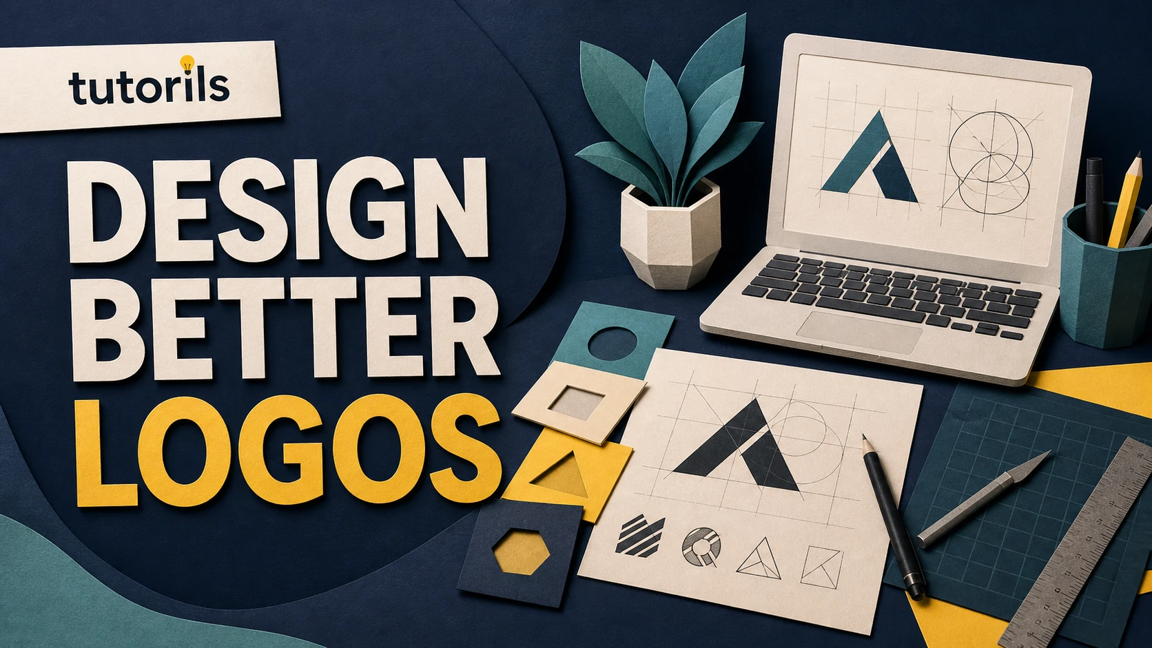
The most reliable Canva logo workflow therefore begins outside the editor. Define the brand, sketch original directions, check competitors, and decide what the logo must communicate. Use Canva to assemble, compare, refine, and export the concept. Do not treat a search result, AI suggestion, or ready-made template as proof that the mark is unique or legally available.
Write a one-page logo brief
Start with the organisation's name, what it offers, who it serves, where it competes, and how it should feel. Add three useful brand traits, such as precise, welcoming, and modern. Avoid empty pairs such as unique and professional because almost every client asks for them.
List the practical uses. A logo for an app must survive as a tiny square icon. A restaurant needs signage and menu applications. A consultant may rely on proposals, LinkedIn, and invoices. State the smallest likely size, the widest likely format, whether embroidery or one-colour printing matters, and which languages the name must support.
Collect competitor logos in a private research board. Look for repeated shapes, colours, initials, and industry symbols. The goal is not to imitate the leader. It is to find visual territory your mark can own. If every local property business uses a roof, a different concept may be more memorable.
For a broader identity system after the logo is approved, see the Tutorils guide to building a Canva Brand Kit. It explains how to keep the final logos, colours, and fonts consistent across later materials.
Sketch concepts before choosing a Canva template
Draw at least a dozen rough ideas with a pen or simple shape tool. Explore a wordmark, lettermark, symbol, combination mark, and a badge if they fit the brief. Keep the sketches fast. At this stage you are testing concepts, not perfect curves.
Ask what each idea means without a paragraph of explanation. A useful logo concept connects the name, audience, product, or attitude in a way that can be remembered. It does not have to illustrate the business literally. A technology company does not need a circuit, and a bakery does not need crossed rolling pins.
Choose three directions that remain clear when drawn in black. If an idea works only because of a gradient or photographic effect, it may fail on a stamp, invoice, favicon, or single-colour sign. Canva's official logo design principles emphasise simplicity, distinction, meaning, and the ability to work across media.
Understand Canva content and trademark limits
Before opening Elements, read Canva's current Content License Agreement. Its prohibited-use section says Canva library Content cannot be used as part of a trademark, design mark, trade name, business name, or service mark, with an exception for fonts. That restriction matters directly to logo design.
Do not build a registrable brand mark around a stock icon, illustration, photo, or decorative library element simply because it is marked Free or Pro. A licence to use content in many designs is not the same as exclusive ownership. Canva's Intellectual Property Policy also explains that ownership of an original Canva design remains subject to third-party content rights.
A safer core logo uses original shapes you create, original artwork you upload with documented permission, and appropriately licensed fonts. Even then, trademark availability is a separate legal question. Search relevant trademark databases and business records in the countries and classes where the brand will operate. For a valuable or high-risk launch, ask a qualified trademark professional to review the proposed mark.
Templates are useful for layout inspiration, not for claiming an exclusive identity. If you start from one, replace the central concept with original work and check every remaining component's source. Do not assume that changing colours and text makes a common template distinctive.
Set up the Canva file deliberately
Create a square design with comfortable working space. Add separate pages for each concept rather than stacking alternatives on one canvas. Name pages clearly, such as Wordmark A, Symbol B, and Combination C. Keep a final page for approved versions only.
Turn on rulers, guides, margins, or position controls available in your editor. Build on a consistent grid. Keep generous clear space around the mark so it can be evaluated without nearby decoration. Zoom out frequently to see whether the silhouette remains recognisable.
Choose one dark neutral and one light neutral for early work. Colour can wait until the shape and typography work. This prevents a favourite colour from rescuing a weak concept. Save deliberate versions rather than overwriting the same page after every decision.
If you work with a team, define who can edit the master, who can comment, and who approves the final. Shared design access is convenient, but accidental movement or deletion can create several unofficial logos. Canva's Brand Hub and Brand Kit tools can later centralise the approved assets and guidance.
Build a strong wordmark
Type the exact brand name and test a small, relevant set of fonts. Compare letter shapes, not just categories such as serif or sans serif. Look at the first and last letters, repeated characters, counters, punctuation, and how the name reads at favicon size.
Use no more than one primary typeface in the core wordmark unless the concept clearly requires a pair. Adjust size, weight, case, spacing, and line breaks with restraint. Large tracking can make a short luxury name feel calm, but it can make a long name hard to scan. Very tight spacing may merge letters in small use.
Check the font licence for the intended commercial use and identity application. Canva permits fonts differently from its other content under the Content License Agreement, but an uploaded font also needs a licence that allows your use. Keep a record of the font name, foundry, licence, and date obtained.
Convert or recreate final lettering outside Canva if a printer or legal workflow requires vector outlines that Canva cannot provide in your plan. Do not stretch a font horizontally or vertically. If the name needs distinctive lettering, commission or create custom modifications with appropriate rights.
Create an original symbol with simple geometry
Start with the core idea from your sketch. Use basic shapes, lines, negative space, and alignment to build the symbol. Keep the number of parts low. Every small notch, stroke, and colour division must survive reduction.
Duplicate the page and test variations rather than continually adding details. Compare filled and outlined versions, symmetrical and asymmetric arrangements, round and angular forms. Ask whether the silhouette can be described in a sentence and recognised without the company name.
Avoid a symbol that is merely a generic industry icon inside a circle. Search the web, app stores, trademark databases, and competitor sites for similar marks. A search cannot guarantee clearance, but it can reveal obvious collisions before you invest in a full identity.
If you upload an original drawing, keep the source file and creation history. If a freelancer supplies the symbol, use a written agreement that addresses ownership and transfer. Canva's interface does not replace those records.
Choose colour for meaning and reproduction
Test the logo in solid black first, then reverse it in white on a dark background. If both fail, fix the construction before choosing a palette. A logo should not depend on a subtle shadow to separate overlapping parts.
Select a primary colour and a restrained supporting palette based on audience, contrast, category, and production. Record exact values for screen and print workflows where needed. A hex value alone is not a complete print specification, and colours vary across screens, paper, inks, and printers. Order a physical proof before a large print run.
Check contrast when the logo contains text or sits beside essential information. Decorative brand colour does not override accessibility. Create an approved high-contrast version for small digital placements and dark backgrounds.
Do not claim ownership of a colour simply because you selected it in Canva. Colour trademarks and industry conventions are legal and contextual questions. Distinction usually comes from the complete mark and its consistent use.
Make a responsive logo family
A single horizontal logo rarely works everywhere. Create a small system: the primary combination mark, a horizontal version, a stacked version, a symbol or monogram, and one-colour positive and reversed versions. Every variant should feel like the same identity.
Define a minimum size and clear-space rule. Test the logo at 16, 32, 64, and 128 pixels, then on a phone screen, business card, social profile, and document header. If fine details disappear at 32 pixels, simplify the small version instead of forcing the full mark into the space.
For social layouts, use the approved compact mark rather than rebuilding it in each post. The Tutorils guide to creating Canva social media posts shows how a logo can support a layout without dominating it.
Review the logo without leading the audience
Present two or three strong directions, not twenty unfinished options. Show each in black, colour, small size, and realistic applications. Explain the design decision in plain language, then ask reviewers what they noticed first, what type of organisation they expect, and what they remember later.
Do not ask only whether they like it. Personal taste can hide practical problems. Look for repeated confusion, accidental symbols, unreadable letters, cultural issues, and similarity to another brand. Test with people who resemble the intended audience, not only the design team.
Record decisions and the person who approves them. If the organisation changes the name, audience, or offer during the process, revisit the brief instead of making the logo carry incompatible ideas.
Export useful master files
Keep an editable Canva master with controlled access. Export transparent PNG files for common digital use at suitable dimensions. Where your Canva plan and design support it, export SVG for scalable workflows. Produce PDF files for review or print only after confirming the printer's specifications.
Check every exported file. Transparency can reveal white elements that appeared on the Canva page. SVG output may handle effects or fonts differently in another program. Open files on a second device and against light and dark backgrounds.
Use predictable names such as brand-primary-dark-rgb.svg, brand-symbol-yellow.png, and brand-wordmark-white.png. Store final assets separately from drafts. Add a short README or brand guide describing background rules, minimum size, clear space, and prohibited changes.
The Tutorils overview of free design tools for creators can help when a final vector cleanup, colour conversion, or specialist export needs another application. Choose the tool based on the required file, not on habit.
Common Canva logo mistakes
The most common mistake is treating a library icon as an exclusive trademark. Others include using too many fonts, relying on effects, copying a competitor's structure, choosing colour before concept, ignoring small sizes, and exporting only one low-resolution file.
Another failure is handing a client a design without a rights record. Keep the brief, sketches, source files, font licences, content-source checks, approvals, and export list together. That folder makes later updates safer and helps the owner explain how the identity was created.
A professional Canva logo is not defined by how quickly it was made. It comes from a distinctive idea, simple construction, deliberate typography, sensible variants, careful rights checks, and files that work in real situations. Canva can make the production accessible, but the designer remains responsible for the decisions.
Reader answers
Frequently asked questions
Open a question to read the answer. Opening another answer closes the previous one.
Can I use a Canva template as my business logo?
You can use a template for exploration, but changing text and colour may not create a distinctive or exclusive mark. Build the final identity from original work and verify rights.
Can Canva Elements be used in a trademark?
Canva's current Content License Agreement prohibits library Content from being used as part of a trademark, design mark, trade name, business name, or service mark, excluding fonts.
What makes a logo look professional?
A professional logo has a clear concept, simple construction, readable typography, useful contrast, distinctive form, consistent spacing, and variants that work from a favicon to large signage.
How many colours should a logo use?
Start with black and white, then choose a restrained palette that fits the audience and production needs. The exact number matters less than clarity, contrast, and consistency.
Which Canva logo size should I create?
Build the master with ample working space, then export sizes for each use. Test the symbol at 16, 32, 64, and 128 pixels plus print applications.
Should I export a Canva logo as PNG or SVG?
Use transparent PNG for common digital placement and SVG for scalable workflows when your plan and design support it. Inspect every export in the destination application.
Can I trademark a logo made in Canva?
Trademark eligibility depends on originality, third-party content, jurisdiction, and potential conflicts. Search relevant records and obtain qualified legal advice for a valuable or high-risk brand.
How many logo concepts should I present?
Develop several sketches, refine three strong directions, and present two or three viable concepts. Too many unfinished choices shift the design work to the reviewer.
What logo files should I give a client?
Provide approved primary, horizontal, stacked, symbol, black, white, and colour versions in suitable PNG, SVG, or PDF formats, plus naming and usage guidance.
Can I use an uploaded font in a Canva logo?
Only if the font licence permits the intended use and you have authority to upload it. Keep the font name, foundry, licence, and acquisition record with the project.