A featured image should tell a reader what an article is about before the title has finished loading. It also has to work in a compact card, a social preview, a large article header, and a phone screen. Designing each image from scratch makes those jobs harder because the rules change with every post.
How to Build a Clean Featured Image System for a Blog
Create a repeatable featured image system with clear layout rules, safe areas, brand controls, responsive exports, and practical review checks.
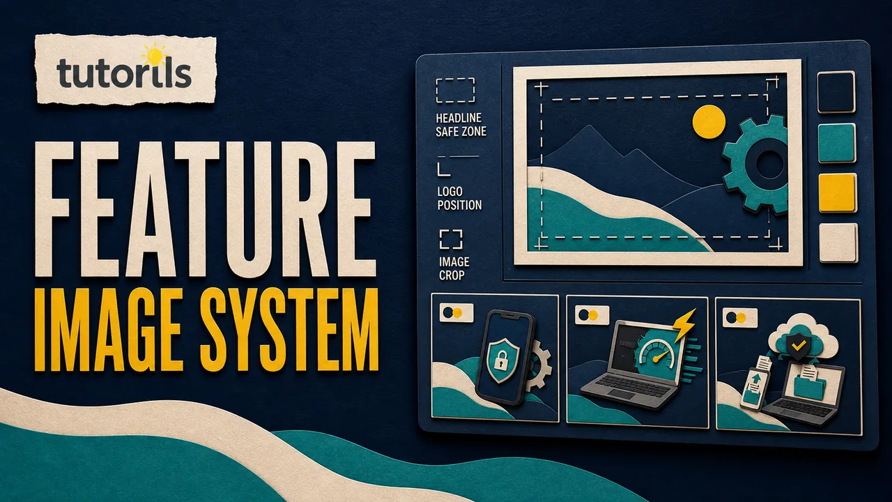
A featured image system solves the repeated decisions. It defines the canvas, subject area, text area, brand placement, color roles, export sizes, filenames, and review checks. The scene can still be unique to each article. What stays consistent is the visual grammar that makes the image recognizable as part of the same publication.
This guide shows how to build that system without turning every thumbnail into the same template. It is intended for bloggers and small editorial teams that want a dependable workflow, clear files, and faster publishing. The result is a working production standard, not a collection of visual trends that may look dated next year.
Decide what the featured image must do
Start with the places where the image will appear. A blog may use one source image in the homepage feed, category cards, article page, RSS feed, search previews, messaging apps, and social networks. Those placements do not give the image equal space. A subject that looks obvious at full width may disappear when the image is reduced to a card.
Write a short job statement for the system. For example: "Help a reader identify the topic at card size, preserve a consistent Tutorils identity, and load quickly on common devices." That sentence gives the designer a basis for rejecting decoration that does not improve recognition.
Separate the jobs of the image and the article title. The image should establish the subject and mood. A short hook can sharpen the promise, but it should not reproduce a long headline. The page title remains the complete description and must make sense without reading words baked into the artwork.
Google's current image SEO guidance recommends images that are relevant and representative of the page. It also advises against using a generic logo or a text-heavy graphic as the preferred image in page metadata. A practical blog system can still use a concise hook, but the visual scene should carry the topic rather than acting as an empty background for a paragraph.
Build a one-page production brief
Put the system rules in one page that a writer, designer, or image tool can follow. A useful brief answers these questions:
- What is the master aspect ratio and pixel size?
- Where may the main subject appear?
- Where may the hook, category label, and logo appear?
- Which colors are fixed and which vary by category?
- How many words may the hook contain?
- Which elements must remain readable at small card size?
- Which file formats and responsive sizes are required?
- What must the reviewer check before approval?
Avoid instructions such as "make it professional" without defining what that means. Replace them with visible rules. You might require one clear subject, a quiet background, strong separation between hook and artwork, a consistent corner for the logo, and no small decorative text.
The brief should also state what is forbidden. Common failures include a stretched logo, a headline copied in full, tiny labels, misleading product screens, unrelated stock imagery, faces with distorted features, and visual claims that the article does not support.
If your publication uses generated artwork, describe the material and lighting as part of the system. Tutorils uses realistic editorial paper craft with a controlled palette. The paper texture, layered depth, and lighting can stay recognizable while the objects and composition change for every topic. The guide to realistic blog thumbnails explains how a distinct subject prevents a consistent style from becoming repetitive.
Choose one master canvas and protect its safe areas
A 16:9 landscape canvas is a practical master for many blog cards and social previews. The exact dimensions matter less than using a large, consistent source and exporting suitable derivatives. A 1280 by 720 master is common, but the system should follow the dimensions required by your theme and distribution channels.
Create guides for four zones:
- The brand zone contains the logo or publication mark.
- The hook zone holds no more than two or three short words.
- The subject zone contains the article-specific visual.
- The breathing zone keeps important objects away from edges and crops.
Do not fill every zone simply because it exists. Empty space helps the eye distinguish the hook from the subject. It also gives layouts room to crop without cutting through a face, device, document, or important object.
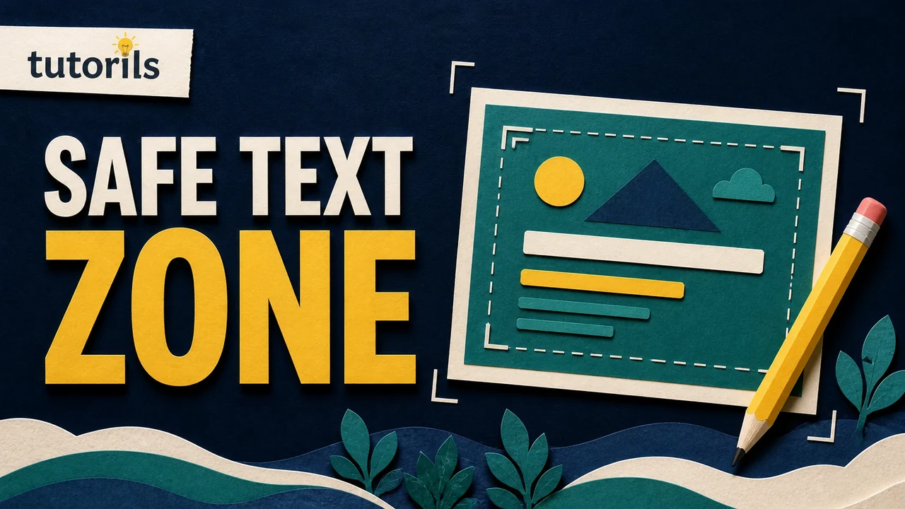
Build the guides into the source template, then test them against the actual website cards. The safe text area guide provides a practical way to test edge clearance rather than guessing from the full-size canvas.
Keep the main visual action within the central area, but allow background texture and secondary shapes to reach the edges. If a platform crops from the center, the topic should remain understandable. If your mobile card uses a different crop, prepare a deliberate art-direction version instead of hoping the desktop composition survives.
Define a layout grammar instead of one rigid template
A rigid template puts the same object, label, and block of text in the same coordinates forever. It is fast, but a category page soon looks like a wall of duplicates. A layout grammar offers a small set of allowed arrangements.
For example, define three compositions:
- hook on the left with the subject on the right
- subject centered with a compact hook in the lower left
- close subject on the left with the hook in the upper right
Each composition should use the same margins, type family, logo treatment, and color roles. Rotate layouts according to the subject rather than at random. A phone, laptop, or person may need a different balance from an abstract workflow or a collection of documents.
Limit the number of visual layers. At thumbnail size, five small objects often read as clutter. Choose one primary object and one or two supporting details that explain the task. For an article about email safety, the primary object could be an envelope with a security check. Supporting elements might show a warning and account shield. The scene does not need every step from the article.
Assign colors by role
A system is easier to maintain when colors have jobs. Define a background color, text color, accent color, support color, and category marker. Record exact values so the palette does not drift between tools.
Keep the publication's core colors stable. Category colors can help readers distinguish sections, but they should not change the logo or weaken contrast. If yellow is the accent used for calls to action and highlights, use it consistently for the hook bar, small label, or focal detail rather than spreading it across every object.
Test the actual text and background combination. WCAG 2.2 specifies at least 4.5:1 contrast for normal text and 3:1 for large text, with defined exceptions. Although a featured-image hook is not a substitute for live page text, those ratios are useful checks for readability. Do not assume that two colors contrast simply because their names sound different.
The Tutorils guide to color psychology for thumbnails can help you select an appropriate mood. Use color to support recognition and hierarchy, not to make unsupported claims about guaranteed emotional reactions.
Make type rules simple enough to follow
Choose one heavy display face for the hook and, if needed, one small face for the category label. More fonts add maintenance without adding clarity. Define uppercase or sentence case, line spacing, alignment, maximum lines, and minimum size.
Keep hooks short. Two or three words are enough for most cards. "EMAIL BREACH CHECK" is easier to recognize than a compressed version of a twelve-word headline. The hook should complement the page title and remain accurate. Do not use alarm words that exaggerate the article.
Prepare a hook-length test in the source file. Try a short word, a long word, and a three-word phrase. Set rules for what happens when text does not fit. The right response is usually to rewrite the hook, not squeeze the letters, reduce the size below the minimum, or stretch the text box into the subject.
Preserve the logo exactly. Store one approved transparent asset and lock its proportions. Define its minimum size, corner position, and clear space. Do not redraw it through an image generator or place it over a busy part of the scene.
Separate reusable parts from article-specific parts
The reusable layer should contain only the system: canvas guides, type styles, brand asset, category label, palette tokens, shadow treatment, and export presets. The article layer contains the subject, supporting objects, hook, alt text, and filename.
This separation makes revisions safer. A change to the logo spacing can update future work without replacing every article scene. A new article can use the same system while remaining visually unique.
Create a short visual brief for each post before making the image:
- article promise in one sentence
- main subject and action
- two supporting objects at most
- chosen layout
- category color
- two-to-three-word hook
- details that must not appear
The brief should be based on the final article, not only its working title. If the article changes direction during editing, update the image plan. The AI image prompt guide shows how to describe composition and subject clearly, but the same brief works for photography, illustration, or manual paper craft.
Use a predictable file and export workflow
Give the master and every export a filename based on the final slug. Avoid generic names such as final-image-2.webp. A clear pattern might be:
article-slug-master.psd
article-slug.webp
article-slug-960.webp
article-slug-640.webp
Keep editable masters outside the public web folder. Store only the approved web exports on the server. Version the master when the composition changes, but keep the public filename stable if your deployment process safely replaces derivatives and clears caches.
Export WebP when it suits the site's browser support and workflow. Set a realistic file-size target, then inspect the result rather than forcing every image below one arbitrary number. Fine paper texture, faces, and text edges can break at aggressive compression. Compare the export at 100 percent and at actual card size.
Provide responsive variants instead of sending the largest source to every device. MDN's responsive image guide explains how srcset and sizes let a browser select an appropriate resolution. It also distinguishes resolution switching from art direction, where a different crop is supplied for a narrow layout.
Always set width and height attributes or reserve the image's aspect ratio in CSS. That lets the page hold the correct space while the file loads and reduces layout movement. Keep the alt attribute with the content record rather than baking it into the filename.
Connect the image to the CMS and social preview
The CMS record should store the featured image path, descriptive alt text, approved hook, style name, generation or source notes, and review status. If the site creates several responsive files, generate their paths from one base name so editors do not assign them manually.
Set the preferred social image through the page metadata used by your platform. The Open Graph protocol defines og:image as a basic property for the image representing an object. Test the public URL in the sharing tools for the channels you use because cached previews may continue to show an older file.
Google recommends standard HTML image elements, relevant surrounding page content, descriptive filenames, and useful alt text. Alt text should describe the meaningful visual, not repeat the article title or list keywords. A suitable description might be "Paper craft layout template with a protected logo area, short headline zone, and article subject panel."
Do not treat the social preview as proof that the on-page image is correct. Check the homepage card, category card, article header, mobile card, RSS output, and a shared link separately.
Review at the sizes readers will see
An approval view should show the image at full size and at the smallest common card size. Ask the reviewer to answer concrete questions:
- Is the topic recognizable without reading the article title?
- Is the hook accurate, short, and readable?
- Is the logo the approved asset with correct proportions?
- Does the subject survive center and mobile crops?
- Is any important object hidden behind an interface label?
- Does the image remain distinct from recent posts?
- Are the filename, alt text, and category correct?
- Do the responsive files exist and load?
- Is the WebP quality acceptable at card and header size?
- Does the public social preview show the approved image?
Reject an image when it fails a required placement, even if the full-size artwork looks attractive. The purpose of the system is to remove that subjective hesitation from production.
Maintain the system without redesigning it every month
Keep a small contact sheet of recent featured images. It reveals repetition, color drift, weak hooks, and overused compositions faster than opening files one by one. Review the sheet after each batch and record only changes that solve a repeated problem.
Track corrections. If mobile crops repeatedly cut off the same zone, change the guide. If a category color fails contrast checks, update the token and document the replacement. If one layout consistently makes long objects unreadable, restrict it to subjects that fit.
Do not change the whole visual identity because one article performs poorly. Clicks depend on the topic, distribution, title, audience, and placement as well as the image. Treat the system as a production method and evaluate patterns across a useful sample.
A clean featured image system gives every post a recognizable home while leaving room for an original scene. Define the jobs, protect the canvas, use a small layout grammar, preserve the brand asset, export responsive files, and review the placements that readers actually see. Once those decisions are written down, the team can spend more time representing each article accurately and less time rebuilding the process.
Reader answers
Frequently asked questions
Open a question to read the answer. Opening another answer closes the previous one.
What should a blog featured image system include?
Include a master canvas, safe areas, logo rules, type styles, color roles, approved layouts, export sizes, filename pattern, alt-text guidance, and a review checklist.
Should every featured image use the same template?
No. Keep the brand rules and layout grammar consistent while changing the subject, supporting objects, composition, and hook to represent each article accurately.
What is the best featured image size for a blog?
Use the dimensions required by your theme and channels. A large 16:9 master is practical for many blogs, then export responsive sizes for cards and mobile screens.
How long should featured image text be?
Use a concise two-to-three-word hook when text is needed. The image should not copy the complete article title or depend on tiny supporting labels.
How should a logo appear on featured images?
Use the approved logo asset without redrawing, stretching, recoloring, or cropping it. Define one position, minimum size, and clear-space rule in the system.
Can each blog category use a different color?
Yes, if category colors have documented roles and maintain readable contrast. Keep core brand colors and logo treatment consistent so the publication still feels unified.
Is WebP suitable for blog featured images?
WebP is useful when it fits your browser and CMS workflow. Inspect text edges and detailed textures after compression, and keep an editable master outside the public web folder.
What makes good alt text for a featured image?
Describe the meaningful scene and its connection to the article. Do not repeat the headline, start with image of, or fill the description with target keywords.
Why should a blog export responsive image sizes?
Responsive files let the browser load a suitable resolution for the displayed slot. This avoids sending the largest source image to every device while preserving visual quality.
How often should a featured image system be reviewed?
Review contact sheets after each production batch and check the system annually. Change documented rules when repeated crop, contrast, file-size, or brand problems show a clear pattern.