
Category colors can help readers recognize sections in a magazine, blog, dashboard, or social series. They work only when the system stays consistent and the label remains understandable without color.
How to Create Consistent Category Colors
Build a documented category-color system with semantic roles, accessible pairings, written labels, light and dark modes, and controlled CMS mappings.
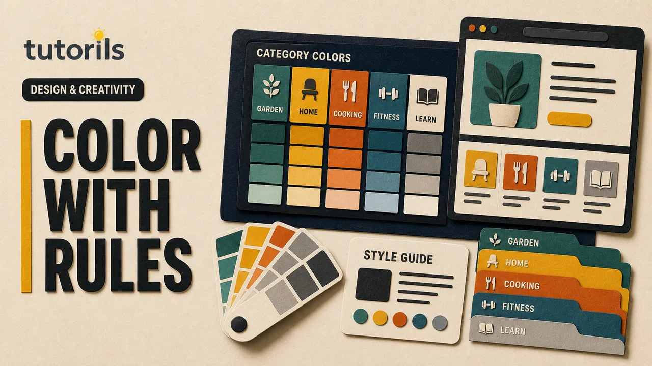
Build the palette around named roles, readable combinations, and a documented assignment table. Test every category on the surfaces where it appears, including cards, text links, icons, charts, dark mode, and mobile screens.
Define what category color should do
Write the use cases before choosing swatches. Category color might appear in:
- a small label above an article title
- a navigation tab or filter
- a card border or accent line
- an icon background
- a chart legend
- a social post template
- a newsletter section marker
Decide whether color helps navigation, grouping, promotion, or decoration. If it carries meaning, it needs a non-color cue such as the written category name, an icon with a label, a pattern, or a structural position.
Do not use category color as the only difference between two identical buttons or unlabeled dots. W3C's Use of Color guidance explains that color cannot be the only visual means of conveying information.
Inventory the categories and surfaces
List current categories, planned categories, and any categories that may merge or disappear. Record where each one appears and which backgrounds it must work against.
For each surface, note whether the category color is used as:
- text on a light background
- text on a dark background
- a background behind text
- a border or underline
- an icon or data mark
- a large decorative area
The same raw color may not work in every role. A bright yellow can be a strong accent on dark navy but fail as small text on white. Build role-specific combinations rather than forcing one hex value everywhere.
Start from the brand palette
Use approved brand colors before inventing a separate rainbow. Review the logo, editorial palette, neutral colors, and existing interface states.
Tutorils' guide to creating a brand kit in Canva explains how to organize logos, fonts, and colors. Preserve approved logos exactly and treat category colors as an extension of the brand system.
Choose a restrained set of category families that can coexist with the primary brand accent. Too many equally saturated colors create noise and make important actions harder to identify.
Do not assign color based on a universal emotion claim. Tutorils' color psychology guide explains that response depends on context, culture, contrast, and prior associations. Category colors are identifiers, not guarantees about trust, energy, or clicks.
Assign colors by role, not memory
Create a category-color table with fields such as:
Category | Token name | Base color | Text on light | Text on dark | Tint background | Border | Icon | Approved combinations
Use semantic names such as category-ai-accent rather than bright-blue-3. The name should describe the purpose so an editor does not choose a color by appearance alone.
Separate the category identity from the presentation roles. One category can have a base hue plus tested dark and light values. This lets a label remain recognizable without failing contrast.
Figma's variables overview describes reusable color variables and modes for contexts such as light and dark themes. Whether you use Figma, CSS variables, or a CMS color field, maintain one controlled source of truth.
Choose distinguishable category families
Place all category colors together at the sizes they will appear. Two blues that look different in a large palette can become indistinguishable as small label bars.
Vary more than hue when readers must distinguish items. Use lightness, saturation, label text, icons, or pattern carefully. Avoid assigning red and green as the only difference between categories.
Check the palette in grayscale and with color-vision simulations. These checks do not replace contrast measurements or user testing, but they reveal pairs that depend too heavily on hue.
Keep future expansion in mind. Reserve a process for adding a category instead of selecting the next attractive swatch. If the palette cannot support another distinct category, use grouped families or stronger textual labels rather than forcing subtle differences.
Test text contrast for every pairing
Measure the actual foreground and background values. Do not test the base swatch once and assume every tint, overlay, photograph, and state passes.
Small category text needs strong contrast. If the category color is too light for text on white, use a darker role value or place dark text on a pale tint. Keep the familiar hue family while changing the role value.
Test normal, hover, focus, selected, disabled, and visited states where relevant. A selected tab should remain identifiable without relying only on a color change.
For icons, borders, and controls whose shape is needed to understand the interface, consult W3C's Non-text Contrast guidance. It explains testing meaningful graphical objects against adjacent colors in covered situations.
Keep the written category label
Always display the category name where readers need to know the category. A colored strip beside an article card can support the label, but it should not replace it.
Use consistent wording. Do not show "AI" in one place, "Automation" in another, and "Smart Tools" elsewhere for the same category unless those are intentionally different concepts.
Keep labels readable when images fail, custom fonts do not load, or styles are removed. In a web interface, the category should exist as text in the document, not only as words baked into a thumbnail.
For a complex chart or diagram using category colors, provide the full information through nearby text or a structured table. W3C's Complex Images tutorial explains the need for a short description and detailed text equivalent when an image carries substantial information.
Apply color consistently across components
Map category roles to components:
- article card: label text and small accent
- category landing page: heading accent and active navigation
- search result: written label plus accent
- featured image: approved category badge
- newsletter: section marker with fallback text
- social template: category label and controlled accent
Do not turn the entire page background into the category color unless readability and brand hierarchy support it. A small repeated cue is often enough.
Create components or styles so editors select the category, not individual hex values. Figma's style guidance describes reusable color styles. In code, use named tokens or CMS mappings rather than values pasted into templates.
Separate category colors from status colors
Red, amber, and green often communicate errors, warnings, and success. If those hues also identify editorial categories, a card may look like a warning or approval state.
List all status and action colors before assigning categories. Reserve critical meanings where the product uses them. Adjust category hue, lightness, placement, or pattern so it does not compete with error messages, buttons, links, or notifications.
Do not use the primary call-to-action color as a large category background. Readers should still recognize what is clickable.
Design light and dark modes deliberately
A color that passes on white may fail on a dark surface. Define role values for each mode instead of inverting colors automatically.
Use category tokens that point to mode-specific values. Figma variables can store different values by mode, and CSS custom properties can serve a similar role in implementation.
Test every category label, border, icon, and selected state in both modes. Review screenshots together to confirm that category identity remains recognizable without making one mode much louder.
Avoid neon adjustments made only to preserve the original hue. A calmer accessible variation is better than a visually harsh match.
Test on real pages and real devices
Create a test page containing every category in navigation, cards, search results, article headers, and related-post modules. Use realistic long titles and images.
Tutorils' mobile-first design checklist helps verify hierarchy on narrow screens. A category accent that looks subtle on desktop can occupy too much of a stacked mobile card.
Check:
- category name is visible without color
- text and meaningful graphics meet required contrast
- adjacent category colors are distinguishable
- actions and status messages keep their own hierarchy
- labels survive long names and translations
- light and dark modes remain coherent
- print and grayscale versions retain meaning
- focus indicators remain visible
Use automated contrast tools and manual review. Ask readers to identify categories from labels and structure, then see whether color improves speed without becoming required.
Extend the system to editorial graphics
Featured images and social posts can use the category accent while keeping the shared brand system. Define where the accent may appear, how large it can be, and which background combinations are approved.
Do not recolor the logo to match each category. Preserve the approved logo. Use the category color in a badge, bar, icon, or supporting paper-craft element.
Tutorils' safe text area guide helps protect category labels and thumbnail text from crops. Keep the category name in page metadata and live text as well.
Document the palette for editors and developers
Create one reference page containing:
- category name and slug
- token names
- color values by mode and role
- approved text and background pairs
- contrast results and test date
- component examples
- prohibited combinations
- owner and review date
Include copyable tokens, not screenshots alone. Explain how to add, merge, rename, and retire a category.
For teams choosing a design application, Tutorils' free design tools guide compares task, export, collaboration, and rights considerations. The color source of truth should remain portable even if the tool changes.
Add a category without breaking the system
Use this sequence:
- confirm that the new category is editorially distinct
- choose a candidate color family that does not conflict with status or action colors
- define light, dark, tint, border, and text roles
- measure every required pairing
- compare it with all existing categories at small sizes
- test grayscale and color-vision simulations
- apply it to real components in both modes
- update tokens, CMS mapping, and documentation together
- announce the change to editors and developers
Do not let individual editors create temporary category colors in production. If a campaign needs a special palette, label it as campaign styling rather than silently changing the category identity.
Review and maintain the mappings
Audit category colors after a redesign, accessibility change, new dark mode, CMS migration, or category restructure. Remove orphaned tokens after confirming they are no longer used.
When a category is renamed, update the label, slug mapping, components, documentation, and analytics taxonomy through a controlled migration. Color alone cannot preserve the old meaning.
Record changes and retain screenshots of key components for comparison. Test the implemented website rather than approving only the design file because CSS, image overlays, and browser rendering can alter the result.
Include printed pages and email previews in that review when categories appear there. Those channels can alter colors, remove backgrounds, or use different rendering rules.
A consistent category-color system uses color as a repeated supporting cue. Written labels, semantic tokens, tested combinations, and controlled components carry the meaning. That structure lets the palette evolve without sacrificing readability or forcing readers to remember what each swatch means.
Reader answers
Frequently asked questions
Open a question to read the answer. Opening another answer closes the previous one.
Why should categories have consistent colors?
Repeated colors can support recognition and scanning across navigation, cards, articles, newsletters, and social graphics. Written category labels must still carry the meaning.
Can category color be the only category label?
No. Display the category name or another non-color cue. Readers should understand the category when colors are unavailable, altered, or difficult to distinguish.
How many category colors should a website use?
Use only the colors required by real categories and the available brand system. When distinctions become subtle, strengthen labels or group categories instead of adding near-duplicate hues.
How do I choose accessible category colors?
Define role-specific values, measure actual text and background pairings, test meaningful graphics, compare categories at small sizes, and review grayscale and color-vision simulations.
Should one category use the same hex value everywhere?
Not necessarily. Keep one hue family but define tested values for text, backgrounds, borders, icons, tints, and light or dark modes.
What is a semantic category color token?
It is a reusable name based on purpose, such as category-ai-accent, rather than an appearance name. Components reference the token so approved updates stay consistent.
How do category colors work in dark mode?
Assign mode-specific role values instead of inverting colors automatically. Test every label, border, icon, selected state, and background in the implemented dark theme.
Can red and green identify different categories?
They should not be the only distinction. Add written labels and other structural cues, and check whether the hues conflict with error, warning, and success states.
How should featured images use category colors?
Use the approved category accent in a badge, bar, icon, or supporting element. Preserve the approved logo and keep the category name in live page text and metadata.
How do I add a new category color later?
Check editorial need, brand and status conflicts, role pairings, contrast, neighboring categories, modes, and real components. Update tokens, CMS mappings, and documentation together.