A reusable social post template should make routine publishing easier without making every post look copied. The useful parts stay controlled: logo treatment, spacing, type hierarchy, color roles, source line, and safe areas. The message, image, emphasis, and format can still change with the content.
How to Build Reusable Social Post Templates
Build a controlled family of social post templates with clear roles, safe areas, reusable components, accessibility checks, and an editor-friendly approval process.

The strongest template system is not one giant canvas resized for every platform. It is a small family of tested layouts with clear editing rules, named components, and realistic content limits. Build the system around the posts you actually publish, then test it with short headlines, long headlines, different images, and phone-sized previews.
Audit the content before designing templates
Collect recent posts and group them by purpose rather than appearance. Useful groups can include:
- a single practical tip
- a tutorial or article promotion
- a quotation with attribution
- a checklist or short process
- a product or service announcement
- an event or deadline notice
- a statistic with its source
- a multi-slide educational sequence
Count only formats that recur. A one-off festival graphic or special announcement does not need to become a permanent template.
For each group, note the platform placement, typical headline length, supporting text, image type, call to action, logo requirement, disclosure, and source line. This inventory prevents you from designing beautiful placeholders that fail when real copy arrives.
Also record what did not work. Text may have been cropped in previews, a logo may have disappeared against a photograph, or a long title may have forced the body into unreadable type. Those problems become requirements for the new system.
Define the content job for each template
Give every template one primary job and a plain name. "Article Card, Portrait" is more useful than "Modern Template 7." Add a one-sentence rule such as: "Use for one article title, one category, one supporting image, and one destination cue."
Avoid making a single layout handle a tip, a quotation, a product offer, and an event. The content structures are different. A small family of focused templates stays more consistent because editors do not need to improvise around unsuitable slots.
Write required and optional fields. For an article card:
- required: headline, category, approved image, brand mark
- optional: short deck, reading time, call-to-action label
- prohibited: full paragraph, raw URL, unverified statistic
The rule protects both readability and editorial accuracy.
Establish a compact brand foundation
Templates need stable design choices before they need decorative elements. Define:
- primary and secondary logo versions
- minimum clear space around the logo
- background colors and approved pairings
- headline and supporting type styles
- spacing increments
- border, corner, shadow, and icon rules
- image treatment and credit placement
If those elements are not documented, build the small brand foundation first. Tutorils' guide to creating a brand kit in Canva provides a practical starting point, while the process applies in other design tools too.
Do not stretch, recolor, redraw, crop, or replace an approved logo to make it fit. Create legitimate light, dark, horizontal, or compact variants from the original brand source only when the brand owner approves them.
Build a master grid and safe area
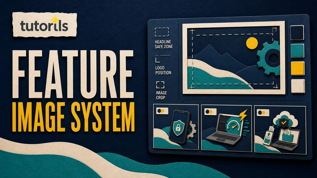
Start with the content area, not the background. Define margins around the edges and a safe zone for text, logos, disclosures, and essential graphics. Keep important content away from places commonly covered by interface controls, captions, profile marks, or crops.
Platform layouts and previews change. Treat current dimensions as settings to verify before export, not eternal rules. Tutorils' safe text area guide for 16:9 artwork explains how to test placement without relying on one permanent coordinate.
Use guides for consistent margins, columns, baseline spacing, and alignment. Keep a visible safe-area layer in the master file but exclude it from export. Name it clearly so another editor does not publish the guides accidentally.
Create separate masters for square, portrait, story-style vertical, and horizontal placements when those formats are actually used. Each needs its own composition. Blind resizing can crop faces, push text behind controls, and shrink disclosures.
Create a readable type system
Use a limited set of text roles rather than choosing a font size for each post. A practical system might include:
- category or eyebrow label
- headline
- supporting sentence
- source or disclosure
- action label
Define font family, weight, line spacing, alignment, and color for each role. Set a minimum readable size based on real device testing, not how large the artwork appears on a desktop monitor.
Write content limits as design limits. For example, a headline role can have a maximum number of lines, not a false promise about an exact character count. Words vary in width, and languages expand differently. If the title exceeds the tested space, editors should shorten it accurately or choose the long-title variant, never keep shrinking the font.
Avoid setting long text in all capitals. Keep line breaks meaningful. Do not split a product name, number and unit, or critical phrase merely to balance a shape.
Create controlled layout variants
A useful template family has predictable variants, such as:
- image left and text right
- image right and text left
- full image with protected text panel
- text-led card with a small supporting graphic
- light and dark approved backgrounds
- short-title and long-title versions
Variants should solve content conditions, not create random visual variety. Name each condition clearly so editors know when to use it.
Figma's official guide to components explains that a main component defines reusable properties and an instance receives updates. Its variants guidance recommends descriptive properties such as type, size, and state. The same logic works in any template tool: separate meaningful controls instead of creating dozens of unexplained copies.
Do not create every possible combination. Build the cases that the content audit proves you need.
Separate locked and editable elements
Editors should be able to change content without accidentally moving the logo, altering margins, or breaking type styles. Lock brand marks, background structures, safe-area logic, and fixed disclosures where the tool supports it. Leave text, images, and approved call-to-action areas editable.
Adobe's current brand-controlled shared template guidance describes templates with locked items and brand style controls. Availability depends on product and plan, so document what your own workspace supports.
If the tool cannot lock layers, use unmistakable layer names and a protected master file. Editors duplicate an approved instance instead of editing the master.
Design image slots that handle real photographs
Define what kind of image belongs in each slot. Note the orientation, focal-point area, minimum usable quality, permitted sources, and credit requirement. Add a focal-point guide so faces and products are not hidden by text.
Test the template with bright, dark, busy, and low-contrast images. Use a solid text panel, gradient, or controlled overlay when required for readability. Do not depend on a shadow to rescue every photograph.
Never use an empty image merely to fill the slot. The image should support the message. Track licenses and permissions with the source file. A reusable template does not make an unlicensed image reusable.
For tool selection by vector, photo, layout, collaboration, and export needs, see Tutorils' free design tools guide.
Use color without making it the only cue
Assign roles to colors: background, primary text, accent, category, border, and action. Do not choose a new palette for every post.
Color can help distinguish categories or post types, but include a written label or symbol as well. W3C's Use of Color guidance explains that information conveyed through color should also be available through another visual cue.
Test contrast in every variant, including text placed over images. Check meaningful icons and boundaries against adjacent colors. Do not treat brand colors as exempt from readability requirements.
Tutorils' color psychology guide for content can help you choose context-aware palettes without claiming that one color guarantees a response.
Plan accessibility outside the pixels too
Text embedded in an image cannot adapt like live page text. Keep it concise, large, and high contrast. Put the complete message in the post caption or linked page rather than forcing every detail into artwork.
Write alternative text for the final published image based on its purpose and content, not the name of the template. If the artwork contains a short quote, product comparison, or process, make the equivalent information available in the caption or linked content.
W3C's Images Tutorial explains that informative images need text alternatives and complex images need a complete text equivalent. A decorative flourish may not need description, but the editor must judge the final context.
Do not place essential meaning only in a color, icon, or tiny source line. Captions, transcripts, and linked articles remain part of the publishing workflow even when the graphic looks complete.
Create an editor-friendly layer structure
Organize layers in the order an editor uses them. A clear structure might be:
- export notes, hidden
- safe-area guides, hidden for export
- brand marks, locked
- fixed background, locked
- image slot, editable
- category label, editable from approved list
- headline, editable
- supporting copy, optional
- source or disclosure, required when applicable
Name components by purpose and format. Use Article Card / Portrait / Long Title, not Group 48 copy 3. Keep deleted experiments out of the production library.
If a shared library is used, assign one owner for publishing master updates. Figma's library guide notes that published changes become available to files using library assets, where collaborators can review updates. Plan the approval process before changing a component used across many posts.
Write a one-page usage guide
The template is incomplete without instructions. Include:
- purpose and approved placements
- required and optional fields
- short and long title handling
- image selection and focal-point rules
- logo and clear-space rules
- approved color variants
- disclosure and source requirements
- export settings
- alt-text and caption responsibilities
- final review and approval owner
Show one correct and one incorrect example. The incorrect example should demonstrate a real failure, such as shrinking the headline below the tested size, covering a face, or deleting a disclosure.
Keep instructions next to the master and record the last review date. A rule buried in an old message will not protect the design.
Test with difficult real content
Replace every placeholder before approval. Test:
- a one-word and a long headline
- names with wide letters and multiple words
- a light image and a dark image
- a face near each edge
- a post with a source and disclosure
- a translated or expanded label if relevant
- the smallest phone preview used by the team
Export each size and upload it to a private draft or preview when the platform offers one. Check crops, compression, interface overlays, and caption relationships. Do not approve the system from the design canvas alone.
Tutorils' guide to designing Instagram carousel posts that people save adds slide sequence and continuity checks for multi-panel content.
Choose sensible export and file rules
Keep the editable master, approved fonts, linked assets, licenses, usage guide, and exported files in a controlled folder. Use PNG for sharp text-heavy raster artwork when file size permits, JPEG for appropriate photographic content, and WebP for supported web placements. Platform upload requirements can change, so check current documentation before delivery.
Use filenames that identify campaign, post type, format, date, and version without exposing private data. Archive the approved export, not every temporary attempt.
Do not flatten the only editable master. Do not hand a public edit link to people who need only an export. Set view and edit permissions according to role.
Add a quality gate before every post
Even a good template can carry a bad claim. Before publishing, verify:
- headline and supporting copy are accurate
- names, numbers, dates, and sources match the approved content
- the chosen template fits the content job
- logo and brand elements are intact
- text is readable at phone size
- crop and safe areas work in the target placement
- color is not the only information cue
- image permission and credit are recorded
- disclosure is present when required
- caption, link, and alternative text are ready
- the correct account and publish date are selected
This check prevents a reusable template from becoming a fast route to repeating the same mistake.
Maintain the system instead of multiplying files
Review templates on a regular schedule and whenever a platform changes its crop, interface, or placement. Track which variants are used, which need manual repair, and which never appear in published work.
Retire unused layouts. Merge duplicates. Add a variant only when a recurring content problem cannot be solved by the existing system. Record changes in a short version log so editors know what changed and whether older drafts need attention.
Do not chase every visual trend. Update the system when readability, brand, platform behavior, or content needs justify it. Consistency comes from stable rules with purposeful variation, not from freezing every post into the same composition.
A practical build sequence
Use this order:
- audit recurring posts
- define the job of each template
- document the brand foundation
- create format-specific grids and safe areas
- define type and color roles
- build only necessary layout variants
- lock stable elements and expose content slots
- add image, source, disclosure, and accessibility rules
- test with difficult real content
- write the one-page guide
- approve and protect the master
- review the library after real use
A reusable social template succeeds when a new editor can produce a clear, accurate post without guessing, while the audience still sees content designed for its message. Build the system around decisions and safeguards, then let each post earn its own visual emphasis.
Reader answers
Frequently asked questions
Open a question to read the answer. Opening another answer closes the previous one.
What should stay fixed in a social post template?
Keep approved logo treatment, margins, spacing, type roles, color roles, safe areas, and required disclosures controlled. Leave content images, headlines, and approved text fields editable.
How many social media templates should a brand have?
Create only the formats supported by recurring content needs. A small family for articles, tips, quotes, announcements, and carousels is easier to govern than dozens of decorative copies.
Can one template be resized for every platform?
Usually not safely. Different placements crop and overlay content differently. Build format-specific masters for the channels you use, then test current previews before publication.
How do I stop editors from breaking a template?
Lock stable elements when the tool supports it, expose clearly named content fields, protect the master, and provide a short guide with real correct and incorrect examples.
What should I do when a headline is too long?
Use an approved long-title variant or edit the wording accurately. Do not keep shrinking the font below the tested readable size or force awkward line breaks.
How can social templates remain accessible?
Use readable contrast, avoid color-only meaning, keep image text concise, test phone previews, and provide accurate captions or alternative text for the final published graphic.
Should every social post use the same layout?
No. Templates should share design rules while using variants suited to the message. Purposeful variation keeps the system recognizable without forcing unrelated content into one composition.
How should I name reusable template files?
Name by content job, format, and variant, such as Article Card, Portrait, Long Title. Avoid vague names like Final 3 or Group Copy that hide the intended use.
Which file formats should I export for social posts?
Use the target platform's current requirements. PNG is useful for sharp text-heavy graphics, JPEG for suitable photos, and WebP for supported web uses. Inspect the uploaded preview.
How often should social templates be reviewed?
Review after real use and whenever brand rules, platform crops, interface overlays, content needs, or accessibility requirements change. Retire duplicates and record approved master updates.