A process infographic should help a reader see what happens, in what order, who acts, and where a decision changes the path. It should not be a long procedure squeezed into a poster.
How to Turn a Process Into a Useful Infographic
Verify a process, simplify its main path, design clear actions and decisions, provide equivalent text, and export a useful infographic for article and mobile readers.
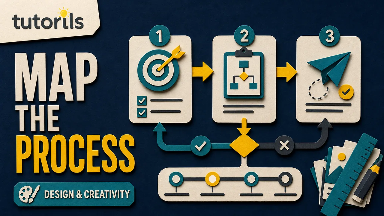
Start with the process itself. Confirm the steps with someone who performs the work, remove details that do not affect the reader's next action, and write the main path in plain text. Only then should you choose shapes, colors, icons, or a template.
This guide uses a practical example, turning an article-review workflow into a web infographic. The method also works for onboarding, account setup, document checks, maintenance routines, and other repeatable tasks.
Choose the reader and the decision they need to make
Write one sentence that defines the reader, situation, and useful outcome:
A new contributor should know what happens after submitting a draft and what to do when an editor requests changes.
That sentence gives the infographic a job. It does not need to explain the publication's entire editorial policy, payment system, style guide, or content strategy.
Avoid starting with "everyone" as the audience. A contributor, customer, support agent, manager, or patient may need different detail from the same process. If one visual tries to serve them all, it often becomes a wall of small text.
Ask what the reader should do immediately after viewing. If the answer is unclear, the process may be informational rather than actionable. A useful infographic can still explain a system, but its purpose should be stated honestly.
Verify the real process before simplifying it
Collect the current procedure, forms, screens, messages, and exceptions. Interview at least one person who performs the process and one person who receives its result when possible.
Write every step in a working list. For the article example:
- Contributor submits draft.
- Editor checks scope and completeness.
- Editor requests changes or begins review.
- Contributor revises when needed.
- Editor verifies revisions.
- Reviewer approves or returns the draft.
- Production prepares the article.
- Publisher releases it at the approved time.
Mark assumptions and disagreements. If one team member says approval happens before fact-checking and another says it happens afterward, the infographic cannot resolve that conflict through layout. The process owner must decide which route is correct.
Record the date and owner of the verified procedure. Processes change. A diagram without ownership can remain in circulation after the instructions are obsolete.
Separate the main path from exceptions
Most readers need the normal route first. Put rare exceptions in a note, secondary branch, or linked procedure rather than building every edge case into the main visual.
Use three buckets:
| Bucket | Include in the main visual? | Example |
|---|---|---|
| Required step | Yes | Editor reviews the draft |
| Common decision | Yes | Changes required? |
| Rare exception | Usually no | Legal escalation for a disputed claim |
An exception belongs in the infographic when the intended reader is likely to encounter it or when missing it creates harm. A safety stop, payment warning, or identity-verification failure may deserve a prominent branch even if it is uncommon.
Do not hide a required action in tiny footer text. If the reader must do it to complete the process, it belongs in the flow or in an immediately adjacent instruction.
Rewrite each step as an action
Use a verb and a clear object:
- Submit draft
- Check required sections
- Revise cited claims
- Approve article
- Prepare publication
Avoid labels such as Quality, Processing, or Next phase. They name a concept without telling the reader what happens.
Keep the same grammatical pattern across comparable steps. If one box begins with a verb, use verbs for the others. Consistency makes the sequence easier to scan.
Move explanations out of the boxes. A process step should not contain a paragraph about policy, deadlines, and exceptions. Put that information in the article, a caption, or a linked checklist.
Numbers can help when order matters, but do not number two branches as if both happen. Use labels such as Yes and No on decision paths.
Choose a structure that matches the process
A straight sequence works when every reader follows the same order. A branching flow works when a decision changes the next step. A cycle works only when the final action genuinely returns to the beginning.
For the article example, use a main horizontal or vertical path with one return loop:
Submit -> Check -> Review -> Approve -> Prepare -> Publish
The decision Changes required? sends the draft to Revise, then back to Review.
Do not choose a spiral, circle, or roadmap merely because the template looks polished. A decorative path can imply repetition, priority, or distance that the real process does not have.
The W3C Web Accessibility Initiative explains that diagrams and flowcharts can help people understand processes. Its visual illustration technique also notes that charts and graphs need text alternatives. Structure the process so it makes sense both visually and in words.
Decide whether you need an infographic at all
A numbered list may be better when the process has four short steps, no branches, and no spatial relationship. Text is easier to update, translate, search, resize, and read with assistive technology.
Use an infographic when visual grouping or direction adds real understanding. Examples include:
- a decision returns the reader to an earlier step
- two roles alternate responsibility
- several inputs converge on one result
- a process contains a visible checkpoint
- the reader needs an overview before opening detailed instructions
If the visual repeats the list without adding a relationship, publish the list and save the design time.
Sketch the process without styling
Use paper, sticky notes, or plain boxes in any drawing tool. Start in black and white. Connect the steps and decisions, then ask another person to follow the path without explanation.
The sketch should answer:
- Where do I start?
- Which direction do I follow?
- Who is responsible here?
- What question causes the branch?
- Where does a rejected item go?
- What counts as completion?
Move boxes until connectors do not cross. Keep the main route visually dominant. A return path can sit below or beside it, with a clear label.
Do not polish an unclear sketch. Color, icons, and shadows make a flawed process more expensive to change, not easier to understand.
Plan for the article column and mobile screen
An infographic designed on a wide desktop canvas can become unreadable inside an article. Check the site's actual content width and the narrow mobile layout before choosing orientation.
A vertical process usually works better for phone readers. A short horizontal process can work when labels are brief and the site provides a responsive image with a useful full-size option.
Avoid putting essential text at the extreme edges. Allow room for cropping, captions, and responsive containers. Tutorils' mobile-first design checklist explains why testing the real narrow layout matters more than shrinking the editor window until it looks acceptable.
If the infographic will also appear in a social carousel, create a separate adaptation instead of cropping the article version. The Tutorils guide to designing Instagram carousel posts covers sequencing ideas across multiple panels. An article figure and a carousel have different reading contexts.
Build a small visual system
Define roles before assigning colors:
- action box
- decision box
- result box
- main connector
- alternate connector
- warning or stop
- heading and label text
Use the same treatment whenever the meaning repeats. If a rounded teal box means an action in one place, do not use it for a decision elsewhere.
One neutral background, one main color, and one accent may be enough. Add another color only when it marks a real category or state.
A documented brand kit helps editors reuse the same roles. The Tutorils guide to creating a brand kit in Canva explains how to record approved colors, type, and assets. The process works in any design tool.
Do not change the supplied logo, stretch it, or use it as a decorative pattern. Brand consistency does not require placing a logo in every stage.
Make direction and responsibility obvious
Use arrowheads for sequence. Put them close to the destination so direction is not ambiguous. Label alternate paths with words such as Needs changes and Approved.
If two roles share the process, use lanes or clear role labels. For example, put contributor actions in one lane and editor actions in another. Keep each lane readable on mobile, or split the process if the lanes become too wide.
Do not rely on avatar colors to distinguish roles. Write Contributor and Editor. Icons can support those labels but should not replace them.
When a step happens automatically, say so. A box labeled System sends confirmation is clearer than a lightning icon that readers may interpret differently.
Keep connector styles consistent. A solid line can show the normal route while a dotted line shows an optional route, provided the legend or label explains that difference.
Use color as support, not as the message
Readers may not see colors in the same way, and some will encounter the infographic in grayscale or under poor screen conditions. Pair color with labels, shapes, borders, or patterns.
W3C's Use of Color guidance says color should not be the only visual means of conveying information, indicating an action, prompting a response, or distinguishing an element.
If green means complete and orange means revise, include the words Complete and Revise. If two lanes use different fills, label the roles at the start and repeat the label where needed.
Color associations also depend on context and culture. The Tutorils guide to color psychology for content can help creators use color deliberately without claiming that one hue guarantees a particular reaction.
Check contrast for text and graphical objects
Thin pale arrows and low-contrast boxes often disappear after resizing. Test the actual exported colors, not only the editor preview.
W3C's non-text contrast guidance calls for at least 3:1 contrast between meaningful graphical objects and adjacent colors. Important lines, shapes, controls, and indicators can fall under this requirement. Text has separate contrast criteria.
Use a contrast checker for:
- label text against its box
- arrowheads against the background
- box outlines against surrounding areas
- status icons against their fills
- decision paths where two colors touch
Borders can separate two light colors without adding more saturated fills. Make lines thick enough to survive compression and scaling.
Do not place text over a busy texture or photograph unless a solid panel provides a stable background. The words must remain readable when the image loads at a smaller size.
Limit icons and illustrations
An icon is useful when it reinforces a familiar action, such as a document for Submit draft. It is unnecessary when the label already communicates the idea and the icon adds clutter.
Use one icon family with consistent stroke weight and perspective. Confirm its licence and keep the source or attribution record required by that licence.
Do not use an illustration that changes the meaning. A lock icon may imply encryption or guaranteed security even when the step only checks a password field. A check mark may imply approval before the process actually reaches approval.
If you need a design application, compare export support, collaboration, licence terms, and accessibility rather than choosing by template count. Tutorils has a task-based guide to free design tools for creators.
Add a title and a direct entry point
Use a title that names the process:
How an article moves from draft to publication
Add one short orientation line if the process has a special condition:
A draft returns to review whenever required changes remain.
Mark the starting point. If the reader can enter at several places, explain why and use distinct labels.
Avoid slogans that compete with the process. The heading should tell the reader what they are looking at, not make a marketing promise.
Write an equivalent text version
The infographic cannot be the only place where the process exists. Provide an ordered list or structured description in the article.
For a complex process image, a short alt attribute can identify the figure and its main purpose. A nearby long description should provide the steps, decisions, branches, and important relationships.
W3C's complex images tutorial explains a two-part approach for images that contain more information than a short phrase can convey: a short description identifies the image, and a long description supplies the essential information.
For the article example, short alt text might say:
Flowchart showing article submission, review, revision when required, approval, production, and publication.
The long description can list the main route and explain that a change request returns the draft to review. Do not fill the alt attribute with every decorative detail.
The text version also helps search, translation, low-bandwidth access, and future updates. It is part of the content, not a fallback written after design.
Test comprehension, not just appearance
Give the draft to a person who was not involved in the process. Ask them to explain:
- the first action
- the normal route
- the decision point
- what happens after a change request
- the final result
Note where they hesitate or choose the wrong connector. Revise the layout before adding more explanation.
Then run visual and accessibility checks:
- view at actual article width
- view on a narrow phone
- zoom the page to 200 percent
- inspect in grayscale
- simulate common color-vision differences if available
- measure text and non-text contrast
- hide the image and read the text alternative
- print a copy when print distribution matters
An automated checker cannot confirm that the infographic matches the real procedure. Ask the process owner to approve the final logic and date the review.
Export for the publishing system
SVG is often suitable for flat shapes, labels, and connectors because it scales cleanly. Use it only when the site safely sanitizes and serves SVG. Remove unexpected scripts, external resources, and editor metadata.
PNG is widely supported and predictable. Export it at sufficient resolution for the article, then compress it carefully. Inspect small text and thin lines after optimization.
WebP may reduce a raster file further, but test legibility after conversion. A small file with damaged labels is not ready.
Use a descriptive filename, such as article-review-publication-process.svg. Save the editable source separately and record the fonts, icon sources, colours, export size, alt text, long description, owner, and review date.
Do not include confidential names, customer data, unreleased product details, or access credentials in the artwork or its filename.
Place and maintain the infographic
Put the visual after the paragraph that introduces the process. Add a caption that states the takeaway:
Figure 1. A draft returns to review after requested changes and reaches production only after approval.
Link to detailed instructions when one box represents a task with several steps. The infographic should provide orientation, while the article or procedure provides execution detail.
Assign an owner and review trigger. Update the infographic when a role, system, form, approval rule, or final destination changes. Retire old copies from shared drives and templates so they do not compete with the current version.
Keep the final checklist with the source file:
- One named reader and purpose
- Verified current process
- Main path separated from rare exceptions
- Action-based labels
- Clear start, direction, decisions, and end
- Roles identified in words
- Color never carries meaning alone
- Readable text and visible graphical objects
- Equivalent short and long text descriptions
- Mobile, zoom, grayscale, and comprehension tests passed
- Export, ownership, and review date recorded
A useful process infographic is a verified procedure expressed visually. Its value comes from correct steps, clear relationships, and an equivalent text version. Styling should make that explanation easier to follow, not turn the process into decoration.
Reader answers
Frequently asked questions
Open a question to read the answer. Opening another answer closes the previous one.
What is a process infographic?
A process infographic is a visual explanation of ordered actions, decisions, roles, and outcomes. It should help a defined reader follow the process, not compress an entire procedure into decoration.
When is a numbered list better than an infographic?
Use a list when the process has a few short steps, no branches, and no spatial relationship. Text is easier to update, translate, search, resize, and read with assistive technology.
How many steps should a process infographic contain?
Include every required action and common decision, but move rare exceptions into notes or linked procedures. If labels shrink or connectors cross, split the process into smaller visuals.
How do I verify a process before designing it?
Review the current procedure, forms, screens, and exceptions with people who perform the work and receive its result. Resolve conflicting versions with the process owner before drawing.
What structure works best for a process infographic?
Use a straight sequence for one route, a branching flow for decisions, lanes for roles, and a cycle only when the final action genuinely returns to the start.
Can color be the only way to show process status?
No. Pair color with words, shapes, borders, or patterns. Label states such as Approved and Needs changes so readers do not have to distinguish hue to understand the process.
What contrast should infographic graphics have?
WCAG guidance calls for at least 3:1 contrast for meaningful graphical objects against adjacent colors. Text follows separate requirements, so test labels, arrows, borders, and status icons independently.
How do I write alt text for a process infographic?
Use short alt text to identify the process and main route. Provide a nearby long description with the ordered steps, decisions, return paths, roles, and essential outcomes.
Which file format should I use for an infographic?
SVG scales cleanly for flat artwork when the site sanitizes it safely. PNG is predictable and widely supported. WebP can reduce raster size, but test small text and lines after conversion.
How often should a process infographic be reviewed?
Review it whenever a role, system, form, approval rule, or destination changes. Record an owner and review date, then remove obsolete copies from templates and shared folders.